Chart of the Day: As U.S. Coal-Fired Electricity Declines, Renewables Rise

We talk a lot about the changing shape of the electricity grid, but what does it look like?
We first came across this rather hypnotic GIF via the Union of Concerned Scientists blog, The Equation, who borrowed it from Pat Knight at Synapse Energy Economics.
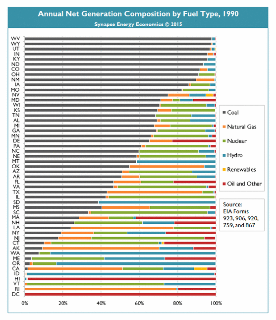 It shows, in animated graph form, how the electricity mix has changed in each U.S. state over the past 15 years. And as UCS senior energy analyst John Rogers notes, the only constant in the “mesmerising” GIF is change.
The really interesting movements come from about 2009 onwards. But Rogers sees five trends in the graph’s “undulating bars” and outlines what’s behind them:
- Coal waning – The most visible change in recent years, says Rogers, is shown in the shrinkage of the dark section on the left of the GIF. “Coal provided fully half of (the US’s) electricity as recently as 2006. Now it’s down to below 40 percent, as the eroding economics of coal have asserted themselves,” he writes.
- Natural gas growing – For the U.S., a big part of the decline of coal (and the rise of concerns about natural gas overreliance).
- Renewables surging – Another reason coal is falling, says Rogers: “the result of smart policies in a lot of forward-thinking states, and great cost reductions. Synapse’s Knight offers this statistic: ‘In 2014, 11 states produced 10 percent or more generation from renewables (compared to zero states in 2005)’.”
- Renewables surging (wind) – Wind, the technology to beat in many U.S. locations, now accounts for more than 10 per cent of generation in nine states, says Rogers, and more than 25 percent in two (Iowa and South Dakota).
- Renewables surging (solar) – At the end of the GIF’s journey, solar starts to make its presence felt, says Rogers – and it’s only just beginning to claim its share of the spotlight, with rapidly increasing scale and rapidly dropping costs. See Hawaii.
Rogers concludes thus:
“The changes visible in these undulations – the cleaner generation portfolios they show are possible – have strong implications for public health and climate change, for our communities, and even for our transportation sector.
All that leaves me wanting to see what’s next, to see what the 2015 data will show, and the 2016 after that… to see where the renewables upwelling will take us next.”
Sophie Vorath writes for RenewEconomy, where the original version of this column first appeared.
Related Content